Skip the Line
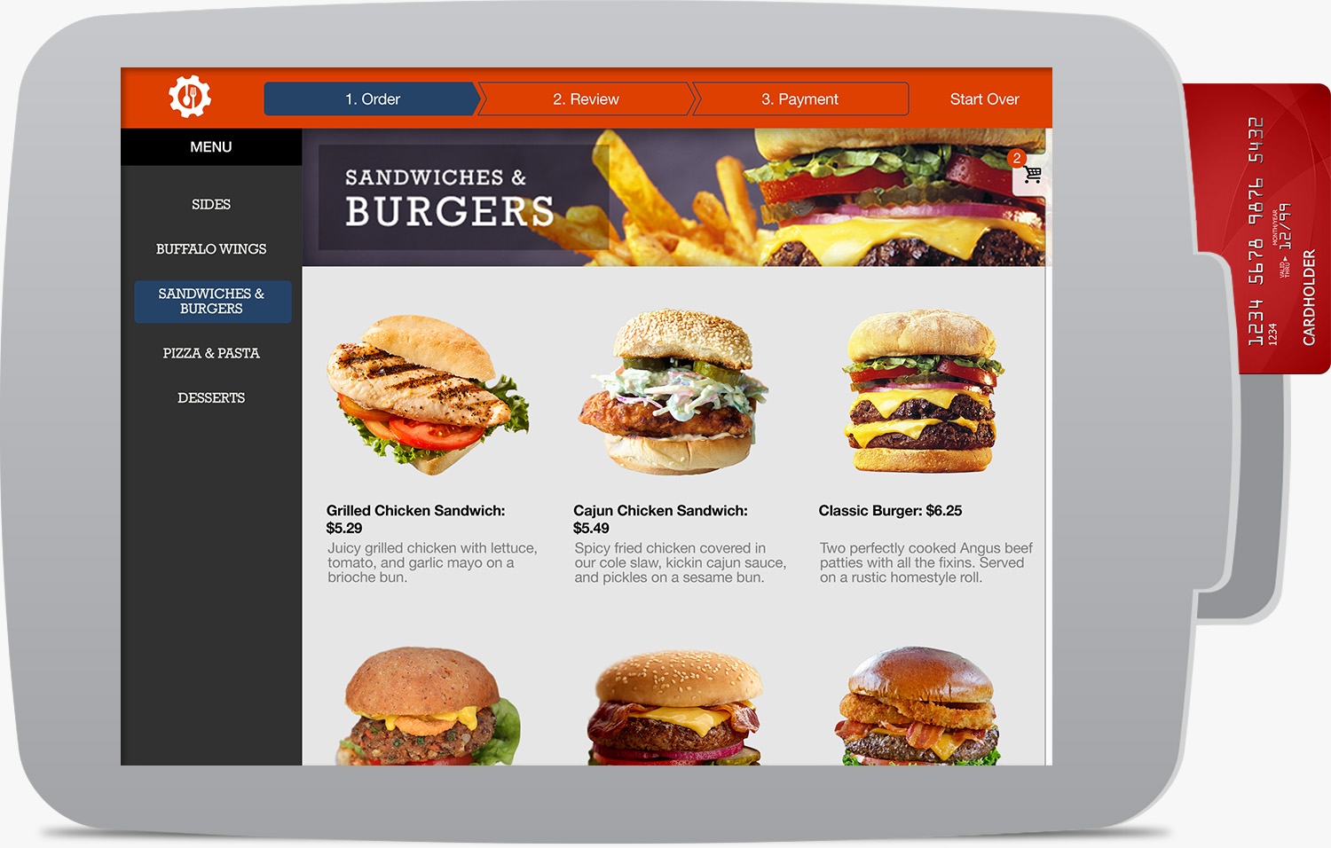
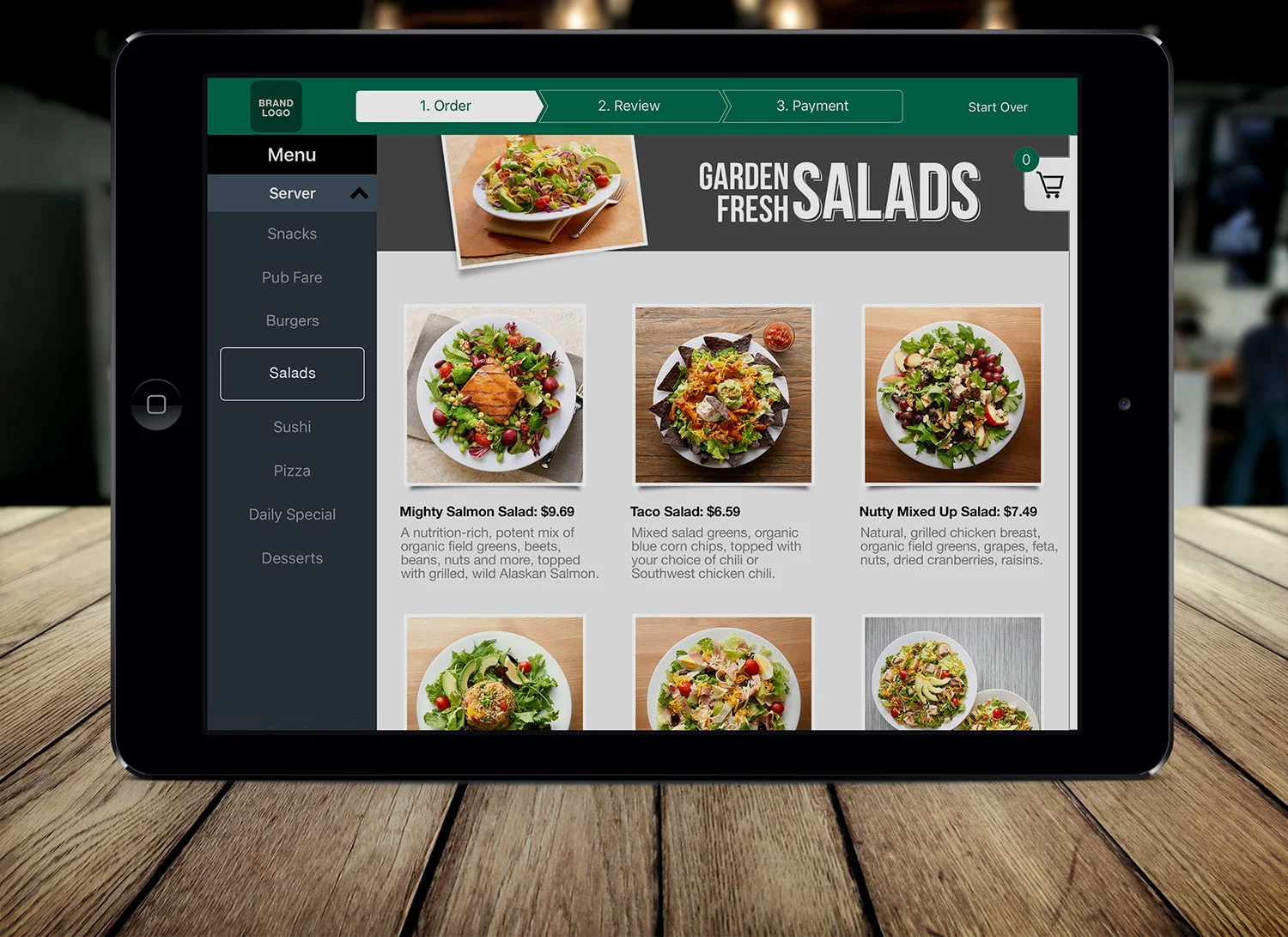
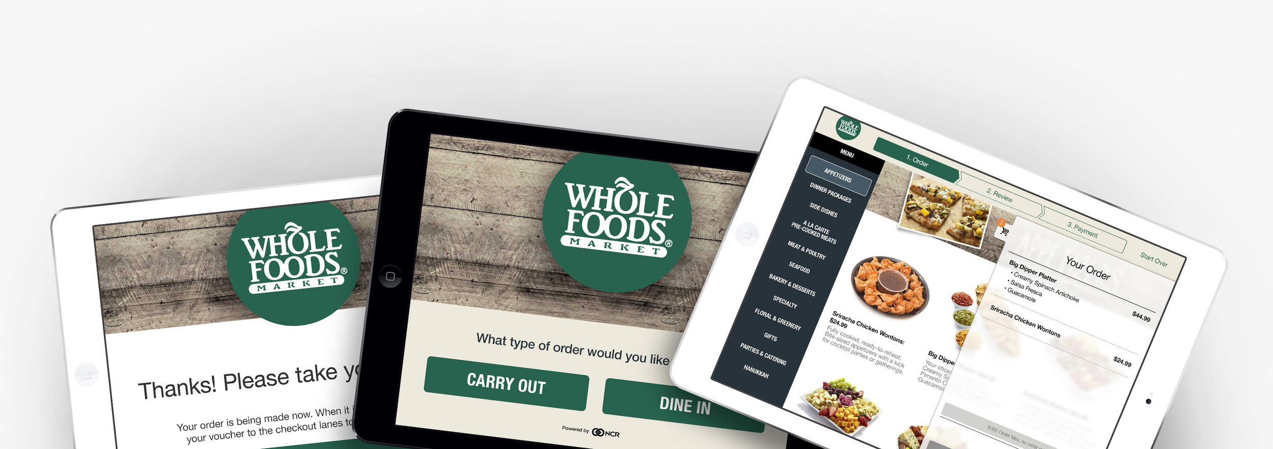
Like the Engage platform, the self-order kiosk was created as a white label product that can be customized easily to any restaurant brand no matter how big or small. It can be used as stand-alone point of sale system in busy restaurants and grocery stores.
Some of the benefits of having a self-order kiosk:
- Line busting
- Decreased labor costs
- Increased speed of service
- Appeal to a younger consumer base
I helped create this product from the ground up, from early sketches and brainstorming sessions with product owners, moving to wireframes and prototypes, and all the way to finalized mockups. The kiosk was adapted from tablet ordering mockups I made for NCR Aloha Online Ordering, so it is a product I can say I’ve had a large hand in crafting from the very beginning.
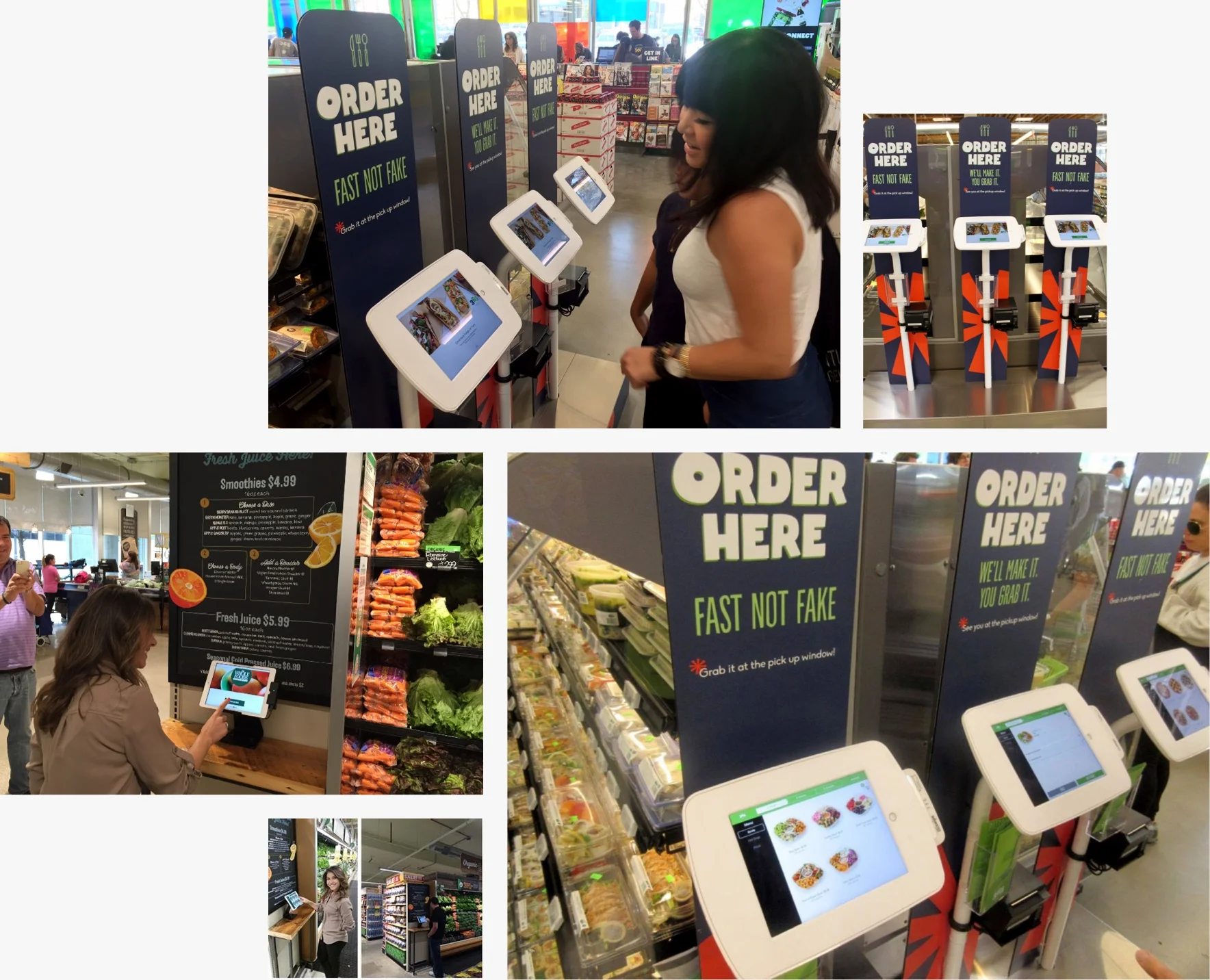
Where you can try the kiosk today
Requirements
- Needed to be highly customizable
- Ability to show promotions
- Ordering and Payment without the need for assistance
- Option to pay later at checkout (ex: grocery store)
- Special instructions and item customization
- Customer can be sent a receipt via email
Sketching and Wireframes
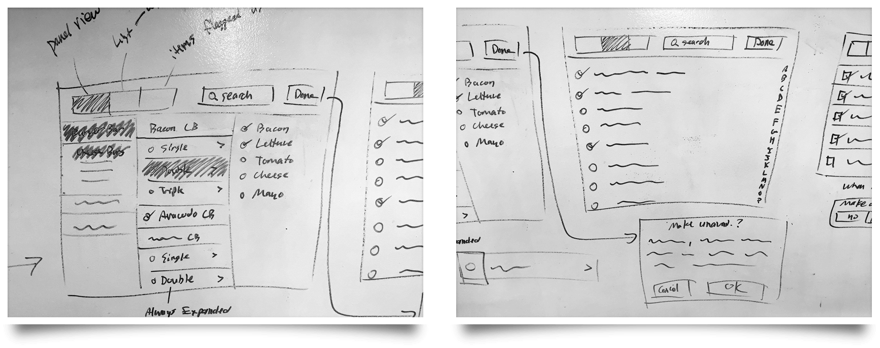
I'm a firm believer in sketching and planning designs out by hand before moving to software. I find that I can iterate much quicker when drawing on a whiteboard or piece of paper. Here are some early planning stages for the kiosk, in particular trying to take advantage of the increased screen space that a tablet can afford instead of a mobile device.
First wireframes planning out the kiosk
Customization
One of the core requirements for the kiosk was to have robust customization capabilities so we could handle a wide range of ordering needs. It can be as easy or as complex as the customer needs it to be.
Review
It's crucial to let the users know exactly what they're paying for along with how much they're paying. Users can become frustrated if they have to dig for this information, especially if the total doesn't match their expectations.
Admin Dashboard
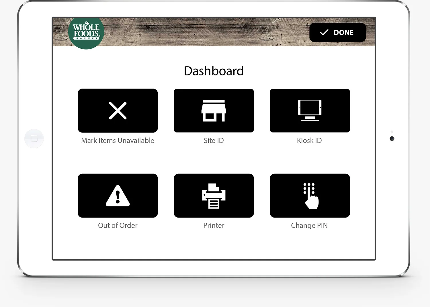
The admin dashboard is a how the kiosk is initially set up. This allows a manager to set an access PIN, configure site and kiosk IDs, and connect receipt printers. A manager can also return to this screen later and make adjustments to inventory or flag the kiosk as out of order.
Whole Foods
If you want to try the kiosk for yourself, the best chance would be to visit a Whole Foods 365 location. These new stores are a lower-priced concept geared toward a younger, more tech savvy crowd and feature self-order kiosks and a smaller footprint.

